JetCo-UI Sample
Integrate the JetCo-UI Library into your project, get sample code snippets for various UI components, with annotations on how to enhance your setup and avoid common pitfalls.
Adding JetCo-UI Library Dependency
To start using the JetCo-UI library in your project, follow these steps to add the dependency:
Android (Jetpack Compose)

Kotlin Multiplatform (KMP)
// add the library in libs.versions.toml
[versions]
jetco-kmp-ui = "1.0.0-beta.8" // jetco-kmp-ui version

[libraries]
jetco-kmp-ui = { module = "com.developerstring.jetco-kmp:ui", version.ref = "jetco-kmp-ui" }

// now implement in build.gradle.kts (in commonMain dependencies)
commonMain.dependencies {
    implementation(libs.jetco.kmp.ui)
}
Android Version: Replace <latest-version> with the latest version from
KMP Version: Currently at 1.0.0-beta.8 - check Maven Central for updates.

UI Components
1. Pie Chart
The PieChart is a composable function that draws a pie chart based on the provided data and configurations. The PieChart supports animation, custom colors, and displays additional chart items. Here's a simple setup:
@Composable
fun PieChartExample() {
    val chartData = listOf(
        Pair("Test-1", 50f),
        Pair("Test-2", 80f),
        Pair("Test-3.beta", 30f),
        Pair("Test-4", 90f),
        Pair("Test-5", 45f),
    )

    PieChart(
        modifier = Modifier.fillMaxWidth(),

        // The data for the pie chart, Map<String, Float>
        chartData = chartData,

        // Configuration for the pie chart, providing options for appearance and behavior
        pieChartConfig = PieChartDefaults.pieChartConfig(
            isChartItemScrollEnable = false
            // You can further customize the pie chart's appearance by adjusting:
            // - color list, radius, thickness, enableChartItems, and more.
        )

        // Additional optional parameters to enhance the pie chart
        // Like: animation pieChartAnimationConfig, chartItemModifier, chartItems, onItemClick, etc.
    )
}
To customize the pie chart, leverage the configuration functions provided by PieChartDefaults. This allows you to make specific changes while maintaining default settings for other properties. For complete customization, consider using the Configuration Data Classes directly. While customizing the colors to match your theme, ensure contrast between colors of the pie chart. To learn more Pie Chart please refer to Guide

Pie Chart
2. Column Bar Chart
Use the ColumnBarChart component to display a bar chart with customizable appearance. This chart represents data using vertical bars with various customization options including animation, axis configurations, and pop-up information. It supports features like axis scaling, grid lines, and bar pop-ups for interactive data visualization. Here’s how you can set it up:
@Composable
fun ColumnBarChartExample() {
    val chartData = listOf(
        Pair("Test-1", 50f),
        Pair("Test-2", 80f),
        Pair("Test-3.beta", 30f),
        Pair("Test-4", 90f),
        Pair("Test-5", 45f),
    )

    ColumnBarChart(
        modifier = Modifier,

        // The data for the chart, Map<String, Float>
        chartData = chartData,

        // The maximum value for the bars in the chart (used to normalize the bar heights, defining the y-axis scale).
        maxBarValue = 100f, // If null, it is determined from the chartData. Defaults to null.

        // Configuration for the bar's width, shape, and other appearance settings
        barChartConfig = BarChartDefaults.columnBarChartConfig(
            width = 20.dp,
            shape = CircleShape
        ),

        // Configuration for the grid lines in the background of the chart
        gridLineStyle = BarChartDefaults.gridLineStyle(
            color = Color(0xFF5700CA)
        ),

        // Enable or disable text rotation on the x-axis labels.
        enableTextRotate = true

        // Additional optional parameters to enhance the Column Bar Chart
        // Like: yAxisConfig, xAxisConfig, popUpConfig, animations, textRotateAngle, onBarClicked and more.
    )
}
To customize the Column Bar Chart, leverage the parameters and configuration functions provided by BarChartDefaults. This allows you to make specific changes while maintaining default settings for other properties. For complete customization, consider using the Configuration Data Classes like BarChartConfig, XAxisConfig, YAxisConfig, PopUpConfig, and GridLineStyledirectly. While customizing the colors to match your theme, ensure contrast between theme colors and Chart colors. To learn more Column Bar Chart please refer to Guide

Column Bar

On Label Click
3. Group Column Bar Chart
The GroupColumnBarChart displays a group column bar chart, where each group contains multiple bars representing different categories. It is highly customizable, supporting various UI configurations like axis styles, grid lines, animations, popups, and more. Here’s how you can set it up:
@Composable
fun GroupColumnBarChartExample() {
    val groupData = listOf(
        "Q1" to listOf(50f, 80f, 60f),
        "Q2" to listOf(70f, 40f, 90f),
        "Q3" to listOf(90f, 30f, 70f),
        "Q4" to listOf(60f, 90f, 80f)
    )

    GroupColumnBarChart(
        modifier = Modifier.fillMaxWidth(),

        // The data for the group column bar chart, Map<String, List<Float>>
        chartData = groupData,

        // The maximum value for the bars in the chart (used to normalize the bar heights, defining the y-axis scale).
        maxBarValue = 100f, // If null, it is determined from the chartData. Defaults to null.

        // Configuration for the group column bar chart, providing options for the bar appearance
        groupBarChartConfig = BarChartDefaults.groupBarChartConfig(
            width = 20.dp, // Set the width of each bar in the group
            shape = RoundedCornerShape(20),
            gapBetweenBar = 2.dp // Space between each bar in the group
        ),

        // Configuration for the grid lines in the background of the chart
        gridLineStyle = BarChartDefaults.gridLineStyle(
            color = Color(0xFFFFFFFF)
        ),

        // Enable or disable text rotation on the x-axis labels.
        enableTextRotate = false

        // Additional optional parameters to enhance the Column Bar Chart
        // Like: yAxisConfig, xAxisConfig, popUpConfig, animations, textRotateAngle, onBarClicked and more.
    )
}
To customize the GroupColumnBarChart, leverage the parameters and configuration functions provided by BarChartDefaults. This allows you to make specific changes while maintaining default settings for other properties. For complete customization, consider using the Configuration Data Classes like GroupBarChartConfig, XAxisConfig, YAxisConfig, PopUpConfig, and GridLineStyledirectly. While customizing the colors to match your theme, ensure contrast between theme colors and Chart colors. To learn more Group Column Bar Chart please refer to Guide
Ensure the datasets are visually distinguishable, especially when the chart is dense with data. Consider using different colors for each dataset.

Group Column Bar Chart

On Bar Click

On Label Click
4. Extended Column Bar Chart
If you need more control over the behavior of the chart (e.g., clicking on a bar), use ExtendedColumnBarChart:
@Composable
fun ExtendedColumnBarChartExample() {

    val chartData = listOf(
        Pair("Test-1", 50f),
        Pair("Test-2", 80f),
        Pair("Test-3.beta", 30f),
        Pair("Test-4", 90f),
        Pair("Test-5", 45f),
    )

    ExtendedColumnBarChart(
        modifier = Modifier,

        // The data for the column bar chart, Map<String, Float>
        chartData = chartData,

        // The maximum length for the text labels on the X-axis to prevent overflow
        maxTextLengthXAxis = 6,

        // The maximum value for the bars in the chart (used to normalize the bar heights, defining the y-axis scale).
        maxBarValue = 100f, // If null, it is determined from the chartData. Defaults to null.

        // Custom label design for the Y-axis scale. The `value` parameter represents the Y-axis label text.
        yAxisScaleLabel = { value ->
            // Card component for styling the Y-axis label with background color and rounded corners
            Card(
                colors = CardDefaults.cardColors(PurpleGrey80), // Set background color of the card
                shape = RoundedCornerShape(20) // Round the corners of the card
            ) {
            // Display the text inside the card
            Text(text = value)
            }
        },

        // Custom popup that appears when a bar is clicked, text based on the bar's value
        barPopUp = { text ->
            // Display the popup with the formatted text using the PopUpLayout component
            PopUpLayout(text = text)
        },

        // Custom popup that appears when an X-axis label is clicked, showing the full text
        labelPopUp = { text ->
            // Display the popup with the clicked label text
            PopUpLayout(text = text)
        },

        // Custom bar design for the chart, with each bar formatted as a card
        barDesign = { text ->
            // Format the bar's value to 2 decimal places using DecimalFormat
            val decimalFormat = DecimalFormat("##.##").format(text.toFloat())
            // Card component to create the bar with specific design properties
            Card(
                modifier = Modifier.fillMaxSize(), // Fill the available size for the bar
                colors = CardDefaults.cardColors(containerColor = Pink40), // Set bar color
                elevation = CardDefaults.elevatedCardElevation(defaultElevation = 20.dp) // Set elevation for shadow effect
            ) {
                // Spacer for padding
                Spacer(modifier = Modifier.height(10.dp))
                // Display the formatted text inside the bar, rotated by -90 degrees
                Text(
                    text = decimalFormat,
                    modifier = Modifier.rotate(-90f),
                    color = Color.White // Set text color
                )
            }
        },

        // Additional optional parameters to enhance the Extended Column Bar Chart
        // Like: yAxisConfig, xAxisConfig, popUpConfig, animations, textRotateAngle, onBarClicked and more.
        // If custom design is implemented then configuration of that component will no longer be applied.
    )
}

@Composable
fun PopUpLayout(text: String) {

    Box(
        modifier = Modifier
            .clip(shape = RoundedCornerShape(100))
            .background(LightBlue)
    ) {
        Box(
            modifier = Modifier
                .padding(8.dp)
                .clip(shape = RoundedCornerShape(100))
                .background(UIBlue),
            contentAlignment = Alignment.Center
        ) {
            Text(
                modifier = Modifier.padding(5.dp),
                text = text,
                color = Color.White
            )
        }
    }

}
If custom design is implemented then configuration of that component will no longer be applied.
    When a custom design (like `barDesign`, `yAxisScaleLabel`, etc.) is implemented,
    it overrides the default configuration for that specific component.
    This means any default configuration properties (e.g., `BarChartDefaults`) related
    to that component will no longer be applied, as your custom implementation takes precedence."
For full documentation / detailed information on customization and usability, this Sample section focuses on providing basic usage examples of the components. If you're looking for in-depth customization options, configuration data classes, default objects, functions, and additional features, please refer to the Guide section for comprehensive details.

Extended Column Bar Chart

On Bar Click

On Label Click
These examples show how easily JetCo UI components can be integrated into your project.
TicketCard Component
The TicketCard component creates beautiful ticket-style cards with authentic cutout notches and dashed dividers.
import com.developerstring.jetco.ui.cards.ticket.TicketCard
import com.developerstring.jetco.ui.cards.ticket.TicketContent
import com.developerstring.jetco.ui.cards.ticket.TicketCardCorner

@Composable
fun TicketCardSample() {
    TicketCard(
        modifier = Modifier
            .width(280.dp)
            .height(400.dp),
        cornerRadius = TicketCardCorner(
            topLeft = 20.dp,
            topRight = 20.dp,
            bottomLeft = 20.dp,
            bottomRight = 20.dp
        ),
        cardColor = Color(0xFFF5F5F5),
        notchRadius = 30.dp,
        dividerColor = Color(0xFF757575)
    ) {
        TicketContent(
            topContent = {
                Column(
                    modifier = Modifier
                        .fillMaxSize()
                        .padding(20.dp),
                    verticalArrangement = Arrangement.Center,
                    horizontalAlignment = Alignment.CenterHorizontally
                ) {
                    Text(
                        text = "CONCERT TICKET",
                        fontSize = 18.sp,
                        fontWeight = FontWeight.Bold
                    )
                    Spacer(modifier = Modifier.height(8.dp))
                    Text(
                        text = "The Amazing Band",
                        fontSize = 16.sp
                    )
                    Text(
                        text = "December 25, 2024 • 8:00 PM",
                        fontSize = 14.sp,
                        color = Color.Gray
                    )
                }
            },
            bottomContent = {
                Column(
                    modifier = Modifier
                        .fillMaxSize()
                        .padding(20.dp),
                    verticalArrangement = Arrangement.Center,
                    horizontalAlignment = Alignment.CenterHorizontally
                ) {
                    Text(
                        text = "ADMIT ONE",
                        fontSize = 16.sp,
                        fontWeight = FontWeight.Bold
                    )
                    Text(
                        text = "Seat A-12 • Gate 3",
                        fontSize = 12.sp,
                        color = Color.Gray
                    )
                }
            }
        )
    }
}
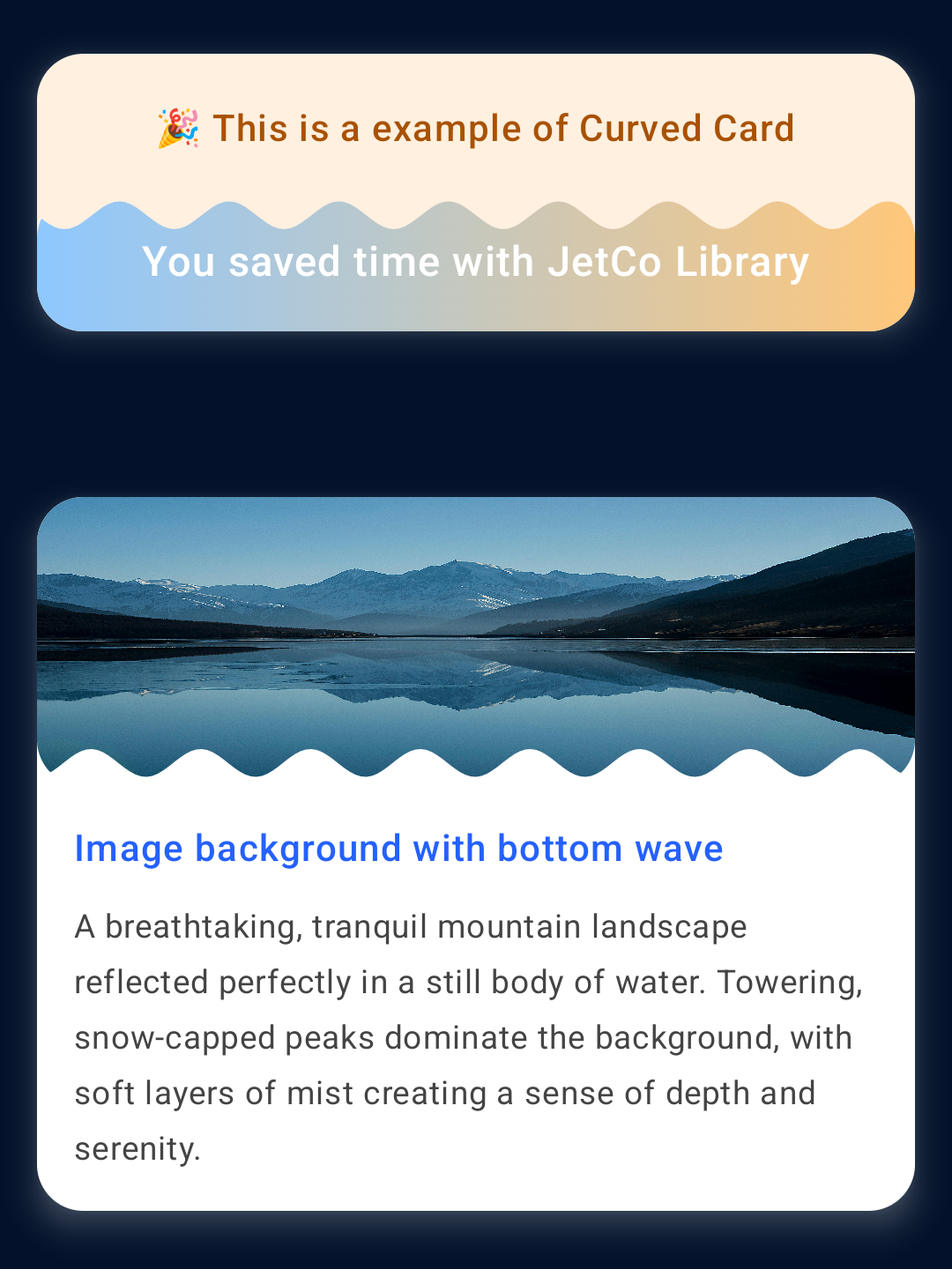
CurvedCard Component
The CurvedCard component creates elegant curved cards with wave animations and customizable backgrounds, perfect for hero sections and interactive displays.
@Composable
fun CurvedCardSample() {
    Column(
        modifier = Modifier
            .fillMaxSize()
            .padding(16.dp),
        verticalArrangement = Arrangement.spacedBy(16.dp)
    ) {
        // Simple Gradient CurvedCard
        CurvedCard(
            modifier = Modifier
                .fillMaxWidth()
                .height(120.dp),
            config = CurvedCardConfig(
                shape = RoundedCornerShape(20.dp),
                gradient = Brush.horizontalGradient(
                    listOf(
                        Color(0xFF8EC8FF),
                        Color(0xFFFFC77A)
                    )
                )
            )
        ) {
            Box(
                modifier = Modifier.fillMaxSize(),
                contentAlignment = Alignment.Center
            ) {
                Text(
                    text = "You saved ₹31 with Gold",
                    fontSize = 18.sp,
                    fontWeight = FontWeight.Medium,
                    color = Color.White
                )
            }
        }

        // Animated CurvedCard with Image Background
        CurvedCard(
            modifier = Modifier
                .fillMaxWidth()
                .height(150.dp),
            config = CurvedCardConfig(
                image = ImageBitmap.imageResource(R.drawable.background_image),
                shape = RoundedCornerShape(20.dp),
                bottomCurveEnable = true,
                topCurveEnable = false,
                imageAlpha = 0.8f,
                waveHeight = 15.dp
            ),
            animConfig = CurvedCardAnimConfig(
                animateBottomWave = true,
                reverseAnimationBottom = true,
                animationDurationMs = 2500
            )
        ) {
            Box(
                modifier = Modifier.fillMaxSize(),
                contentAlignment = Alignment.Center
            ) {
                Text(
                    text = "Image background with animation",
                    fontSize = 16.sp,
                    fontWeight = FontWeight.Medium,
                    color = Color.White,
                    textAlign = TextAlign.Center
                )
            }
        }

        // Dynamic Text CurvedCard
        CurvedCard(
            modifier = Modifier
                .fillMaxWidth()
                .height(180.dp),
            config = CurvedCardConfig(
                gradient = Brush.linearGradient(
                    colors = listOf(
                        Color(0xFF667eea),
                        Color(0xFF764ba2)
                    )
                ),
                shape = RoundedCornerShape(16.dp),
                bottomCurveEnable = true,
                topCurveEnable = true,
                waveHeight = 12.dp,
                waveSegments = 4
            ),
            animConfig = CurvedCardAnimConfig(
                animateTopWave = true,
                animateBottomWave = true,
                reverseAnimationTop = true,
                reverseAnimationBottom = false,
                animationDurationMs = 3000
            )
        ) {
            val textList = listOf(
                "Hello Developers! 🎉",
                "Welcome to JetCo! ❤️",
                "Beautiful UI Components ⭐",
                "Happy Coding! 🚀"
            )

            var currentTextIndex by remember { mutableIntStateOf(0) }

            LaunchedEffect(textList.size) {
                while (true) {
                    delay(2000)
                    currentTextIndex = (currentTextIndex + 1) % textList.size
                }
            }

            Box(
                modifier = Modifier.fillMaxSize(),
                contentAlignment = Alignment.Center
            ) {
                AnimatedContent(
                    targetState = currentTextIndex,
                    transitionSpec = {
                        ContentTransform(
                            targetContentEnter = slideInVertically(
                                animationSpec = tween(500),
                                initialOffsetY = { it }
                            ),
                            initialContentExit = slideOutVertically(
                                animationSpec = tween(500),
                                targetOffsetY = { -it }
                            )
                        )
                    },
                    label = "text_animation"
                ) { index ->
                    Text(
                        text = textList[index],
                        fontSize = 18.sp,
                        fontWeight = FontWeight.Medium,
                        color = Color.White,
                        textAlign = TextAlign.Center,
                        modifier = Modifier.padding(horizontal = 16.dp)
                    )
                }
            }
        }
    }
}
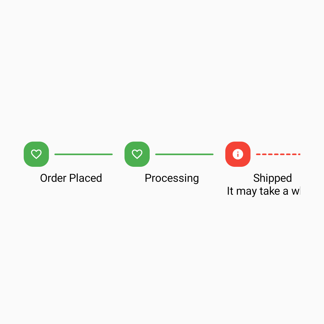
VerticalStepper Component
The VerticalStepper component creates a vertical timeline perfect for order tracking, onboarding flows, and step-by-step processes.
import com.developerstring.jetco.ui.components.stepper.VerticalStepper
import com.developerstring.jetco.ui.components.stepper.model.StepperNode
import com.developerstring.jetco.ui.components.stepper.model.StepperStatus
import com.developerstring.jetco.ui.components.stepper.model.StepperConfig
import com.developerstring.jetco.ui.components.stepper.model.StepperActionIcons

@Composable
fun VerticalStepperSample() {
    val steps = listOf(
        StepperNode(
            title = "Order Placed",
            description = "Your order has been successfully placed",
            icon = Icons.Default.ShoppingCart,
            status = StepperStatus.COMPLETE
        ),
        StepperNode(
            title = "Processing",
            description = "We're preparing your order",
            icon = Icons.Default.Build,
            status = StepperStatus.COMPLETE
        ),
        StepperNode(
            title = "Shipped",
            description = "Your order is on the way",
            icon = Icons.Default.LocalShipping,
            status = StepperStatus.ACTIVE
        ),
        StepperNode(
            title = "Delivered",
            description = "Package will be delivered soon",
            icon = Icons.Default.Home,
            status = StepperStatus.IDLE
        )
    )

    VerticalStepper(
        steps = steps,
        config = StepperConfig(
            node = StepperConfig.NodeStyle(
                activeColor = Color(0xFF2196F3),
                completedColor = Color(0xFF4CAF50),
                size = 36.dp
            )
        ),
        onStepClick = { index ->
            // Handle step click
            println("Clicked step: $index")
        }
    )
}
HorizontalStepper Component
The HorizontalStepper component displays progress horizontally, perfect for wizards and checkout processes.
import com.developerstring.jetco.ui.components.stepper.HorizontalStepper

@Composable
fun HorizontalStepperSample() {
    val checkoutSteps = listOf(
        StepperNode(
            title = "Cart",
            icon = Icons.Default.ShoppingCart,
            status = StepperStatus.COMPLETE
        ),
        StepperNode(
            title = "Shipping",
            icon = Icons.Default.LocalShipping,
            status = StepperStatus.COMPLETE
        ),
        StepperNode(
            title = "Payment",
            icon = Icons.Default.Payment,
            status = StepperStatus.ACTIVE
        ),
        StepperNode(
            title = "Review",
            icon = Icons.Default.Preview,
            status = StepperStatus.IDLE
        )
    )

    HorizontalStepper(
        steps = checkoutSteps,
        showLabels = true,
        config = StepperConfig(
            node = StepperConfig.NodeStyle(
                horizontalStepperWidth = 100.dp,
                size = 32.dp
            )
        ),
        onStepClick = { index ->
            // Navigate to step
        }
    )
}
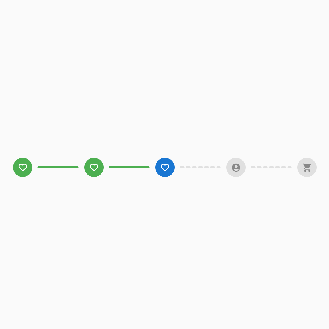
CompactHorizontalStepper Component
The CompactHorizontalStepper provides a space-efficient horizontal progress indicator without labels.
import com.developerstring.jetco.ui.components.stepper.CompactHorizontalStepper

@Composable
fun CompactHorizontalStepperSample() {
    val progressSteps = listOf(
        StepperNode(status = StepperStatus.COMPLETE),
        StepperNode(status = StepperStatus.COMPLETE),
        StepperNode(status = StepperStatus.ACTIVE),
        StepperNode(status = StepperStatus.IDLE),
        StepperNode(status = StepperStatus.IDLE)
    )

    CompactHorizontalStepper(
        steps = progressSteps,
        config = StepperConfig(
            node = StepperConfig.NodeStyle(
                size = 24.dp,
                activeColor = MaterialTheme.colorScheme.primary,
                completedColor = MaterialTheme.colorScheme.primary,
                inactiveColor = MaterialTheme.colorScheme.outline
            ),
            connector = StepperConfig.ConnectorStyle(
                width = 2.dp,
                spacing = 8.dp
            )
        ),
        onStepClick = { index ->
            // Update progress
        }
    )
}
Component Customization
All JetCo components support extensive customization through configuration classes. The examples above show basic usage - check the Guide section for advanced customization options, including animations, custom icons, themes, and responsive behavior.

TicketCard
CurvedCard

CurvedCard Animation

VerticalStepper
HorizontalStepper
CompactHorizontalStepper
For any assistance | questions | queries | help please follow the instruction on the Community Section